Skip to case study
Selected work

Hardware collaboration · 2021

InventHub

Helping hardware teams get started, set up a project, and find their way around a new collaboration tool.
Role
Product design trainee
Focus
Onboarding, information architecture, help content
Project outcome
Reported 38% increase in user activation
InventHub project presentation
InventHub getting-started empty state
InventHub hardware file browser with annotation tools

At a glance

The short version.

01

Challenge

Technically capable users still stalled when empty repositories and unclear navigation hid the product's first useful action.

02

My contribution

I combined heat maps, heuristic review, and focus groups to redesign onboarding, empty states, and workspace hierarchy.

03

Outcome

The project reported a 38% increase in user activation following improvements to getting-started guidance, repository setup, and file viewing.

01 / The starting point

Understanding the problem.

After sign-up, new users often arrived at empty repositories and project spaces without a clear next move. A technically capable product was losing people before they experienced its value.

heuristic evaluationheat mapsactivation UX
The experience I designed for
  1. Get started

    Find guidance after signing up.

  2. Set up a project

    Upload files or connect with Git.

  3. Inspect the design

    Search files and focus on the board.

02 / Research & direction

Technical confidence doesn’t remove the need for guidance.

InventHub supports collaboration on electronic hardware designs.The people using it included hardware manufacturers and supervisors with different levels of technical confidence. I used heat maps, a heuristic review, and focus groups to understand where navigation and missing instructions interrupted their work.

Look at the behavior

Click, scroll, and movement heat maps helped locate places where people got stuck. Focus-group observations added context about their journey through a task.

Review the interface

I examined system feedback, user control, error recovery, and help. The review showed that getting-started guidance and navigation were difficult to find.

Choose a direction

Give empty states a useful next step. Keep help close to the task. Let people focus on their design when they open a file.

03 / After sign-up

An empty dashboard can still help someone begin.

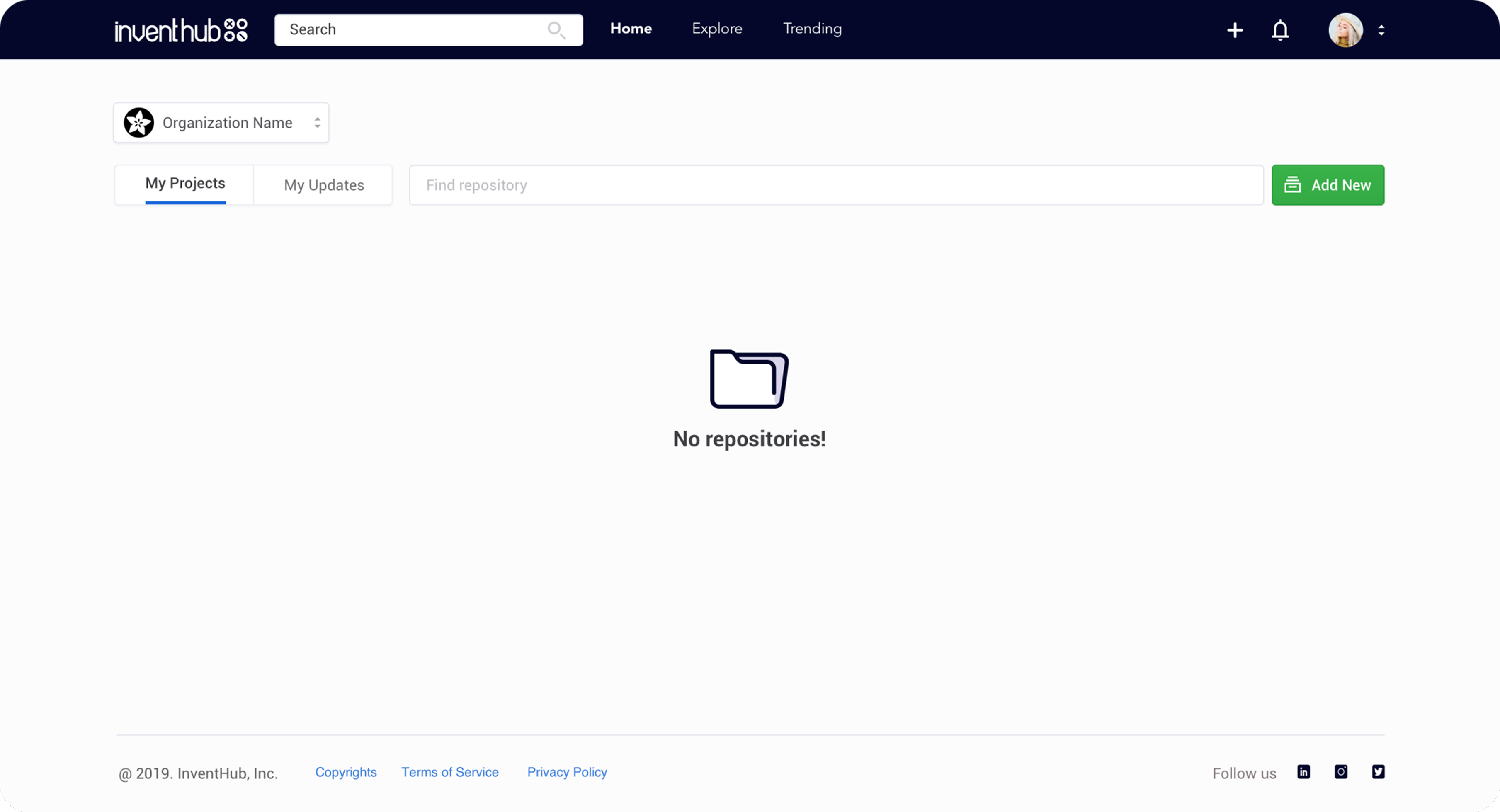
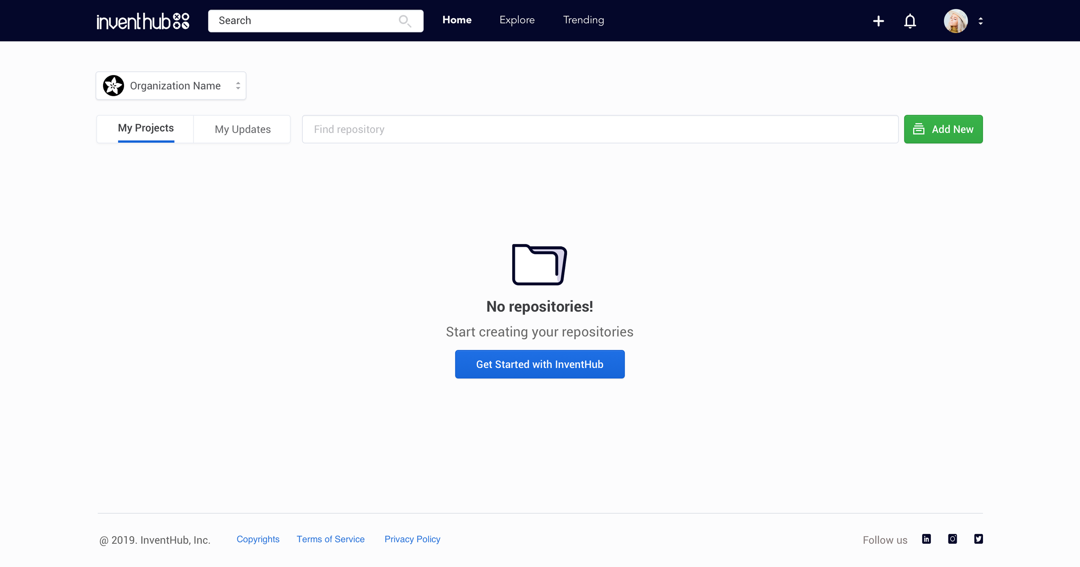
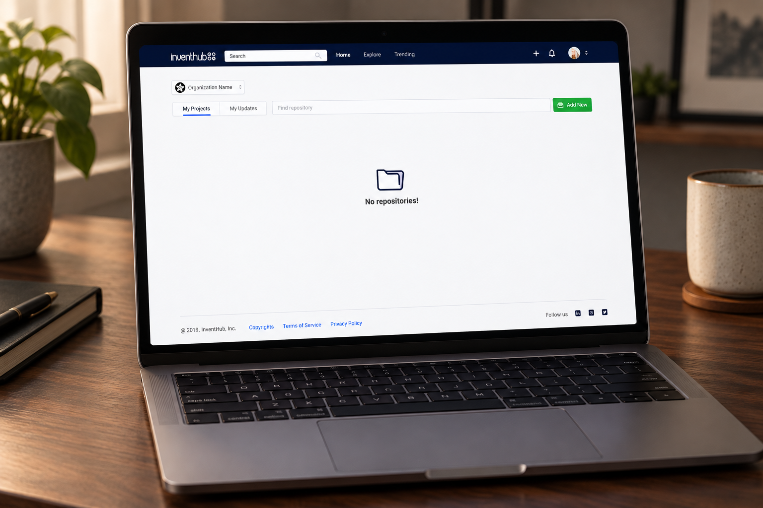
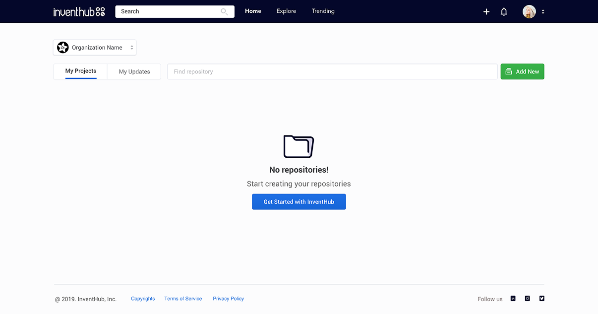
The earlier landing page confirmed that there were no repositories, but offered little guidance.I added a short explanation and a “Get Started with InventHub” action in the empty state. The action connected people to help with creating a repository, at the moment they needed it.
Before

A status message, with no explanation of how to get going.

Earlier InventHub dashboard with a No repositories message and no getting-started guidanceView full screen
After

A clear invitation to start, connected to supporting guidance.

Redesigned InventHub dashboard with a Get Started with InventHub action below the empty stateView full screen

04 / Inside a new project

Make the next step visible inside the repository.

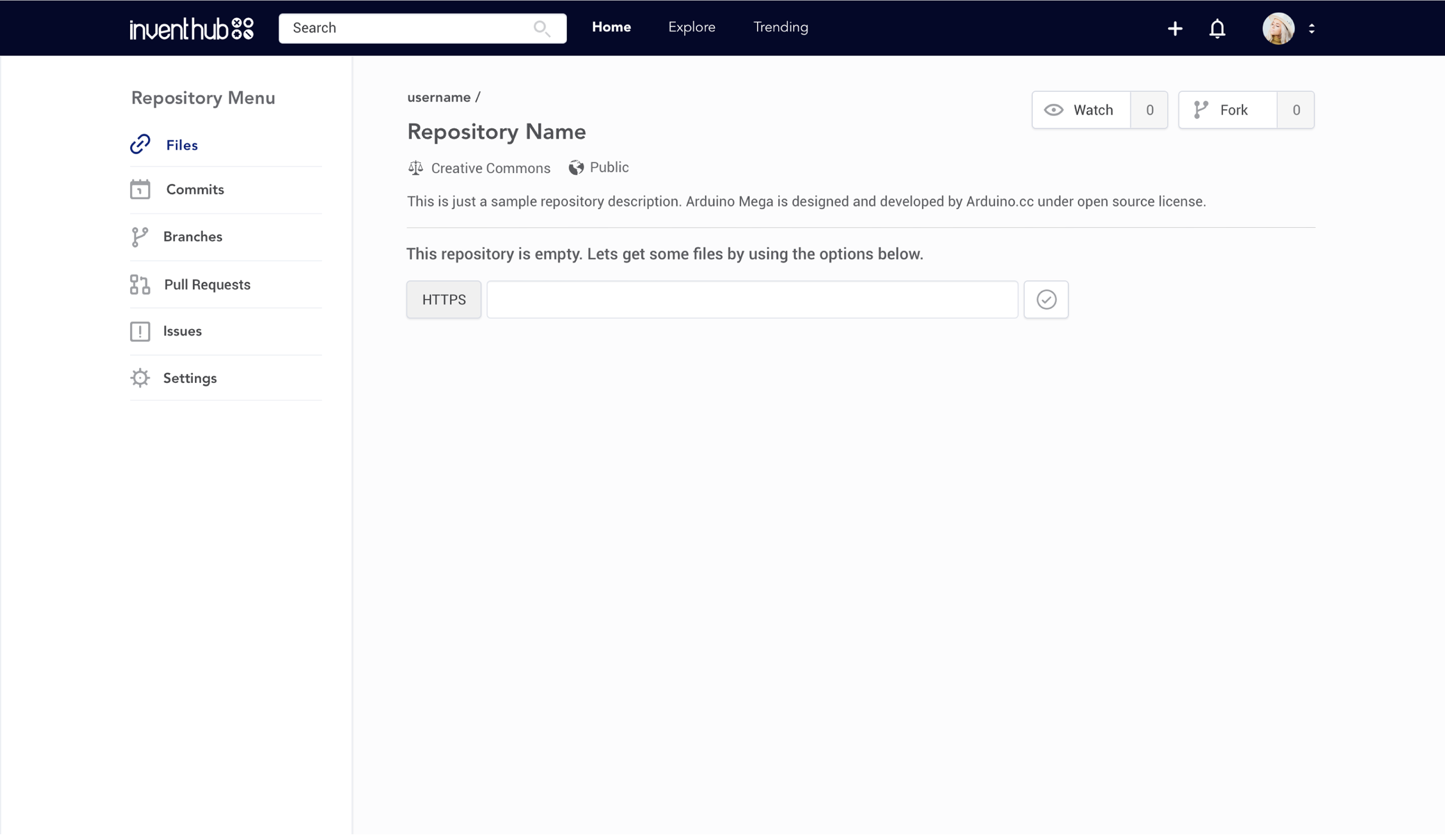
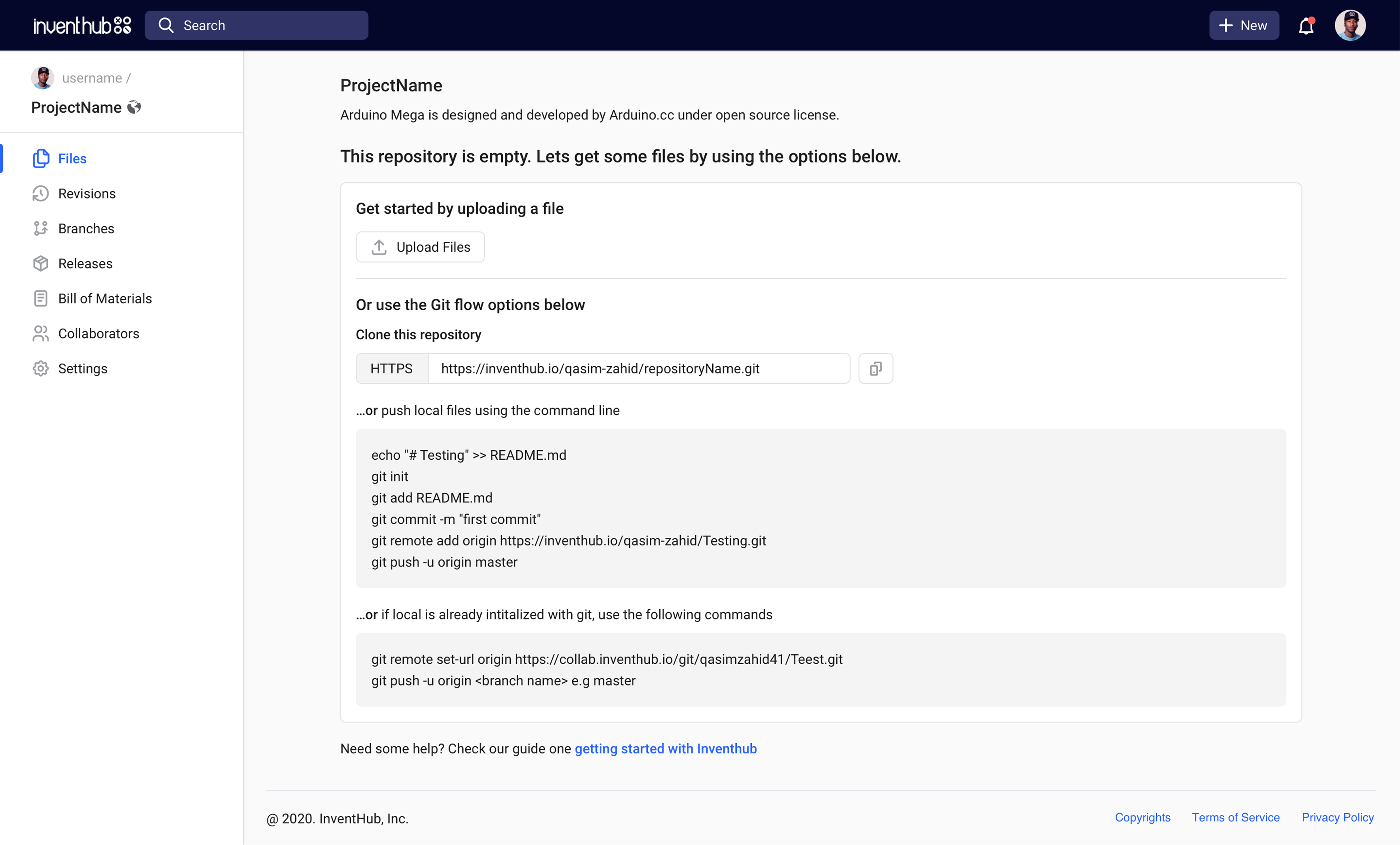
The same uncertainty appeared again when someone entered an empty project.I brought setup instructions into the workspace: upload a file, clone the repository, or follow the relevant Git commands. A getting-started guide stays available below those options. The page now explains how to move forward while preserving the workflows technical users expect.
Before

The repository says it is empty, but the setup path is unclear.

Earlier empty InventHub repository with a message and an unexplained HTTPS fieldView full screen
After

Practical setup options and instructions appear beside the work.

Redesigned empty repository with Upload Files, clone URL, Git commands, and a getting-started guideView full screen

05 / Viewing a design

Give the file the space it needs.

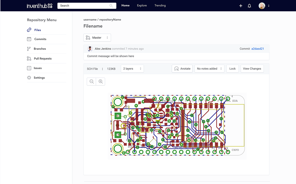
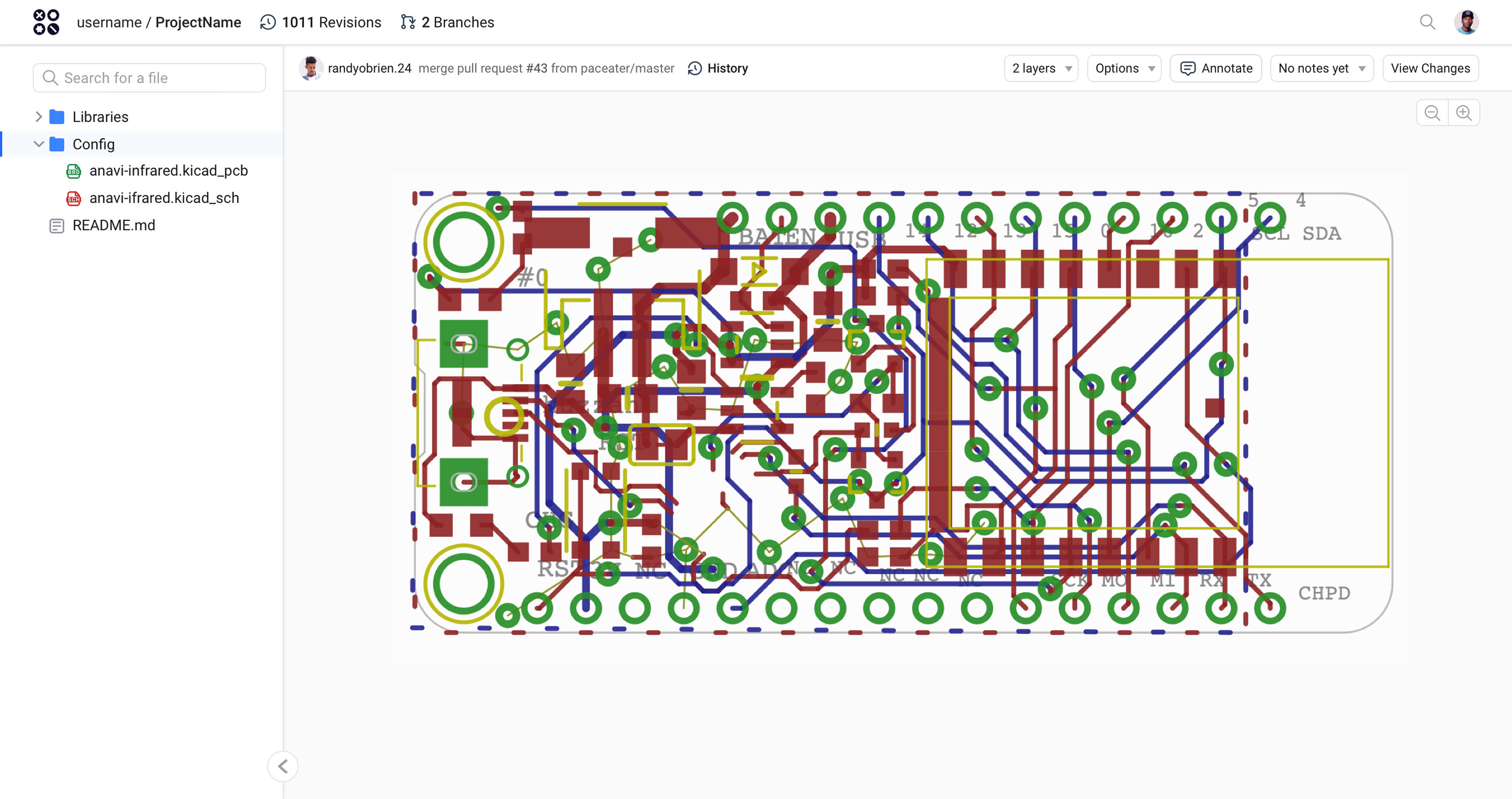
In the earlier viewer, navigation and action controls competed with the board design.I reorganized the workspace around a larger file view. A searchable file tree supports switching files, while revision context, layers, annotations, and change review stay in a compact toolbar. The design becomes easier to inspect without removing the tools around it.
Before

Large navigation and metadata areas leave less room for the board.
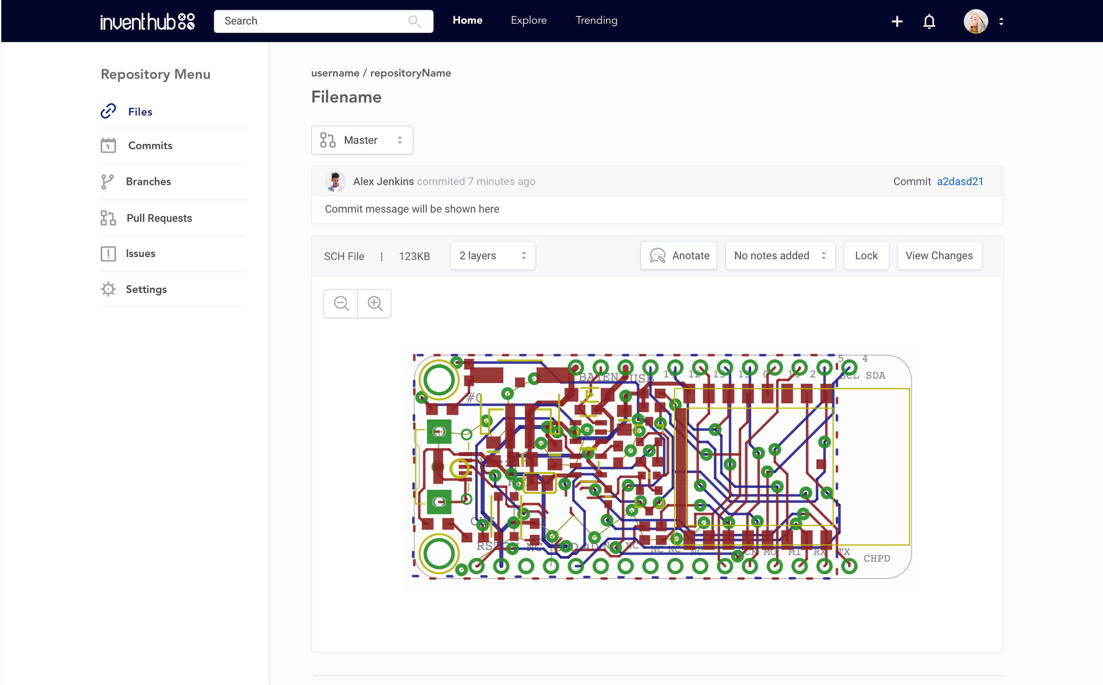
Earlier InventHub file view with broad repository navigation and a smaller circuit-board viewing areaView full screen
After

A focused workspace keeps the file central and related tools close.
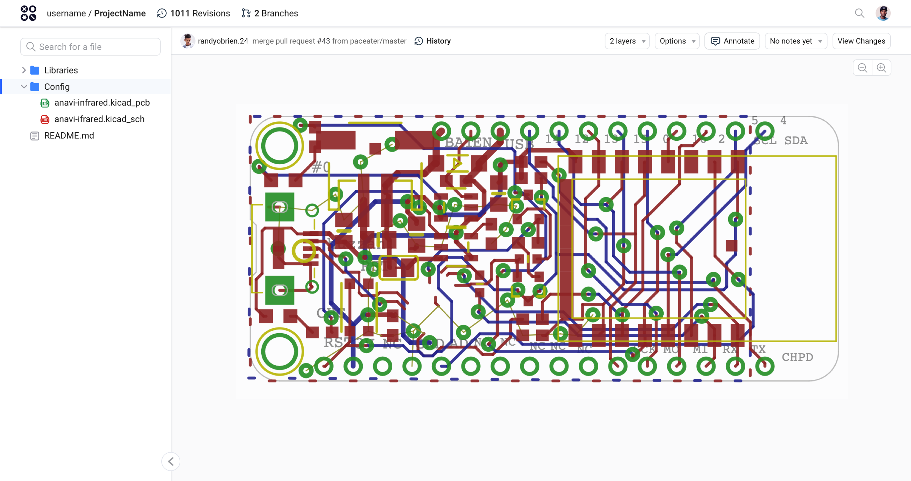
Redesigned InventHub viewer with searchable file tree and circuit board occupying most of the workspaceView full screen
Additional InventHub file-browser version showing search, file tree, revision history, layer controls, and board inspection
The file browser brings navigation and inspection into one continuous workspace.

06 / Outcome & reflection

A clearer path from arriving to doing.

The project reported a 38% increase in user activation.The design changes focused on three moments: finding a first step, setting up a repository, and inspecting a file. My takeaway is that onboarding continues beyond sign-up. Each new workspace needs to explain where someone is and what they can do next.

38%Reported increase in user activation

Keep exploring · 01

Designing with MirrorsBack to all projectsSay hello